Summer is here, and that means a new series for Friday's on the blog!!
Welcome to Food&Wine Friday, where I will be taking some inspiration from my favourite food and wine pairings, and translating them into some arty projects. Neat concept? Hopefully!!
Today, I want to talk about an absolutely delicious wine that I sampled last month, the new White Pear Pinot Grigio by Arbour Mist.
I am in absolutely love with the pastel citrus tones on the label. A frosted bottle mixed with crisp pear green, a splash of yellow and some white font. The light yellow wine in the bottle made me feel like, when the seal was cracked it should have sighed and bubbles should have poured out.
Just amazing, and for me, very inspirational! I've always said that inspiration comes in the strangest of places, and I am finding that in the labels, bottles and pairings of our favourite wines.
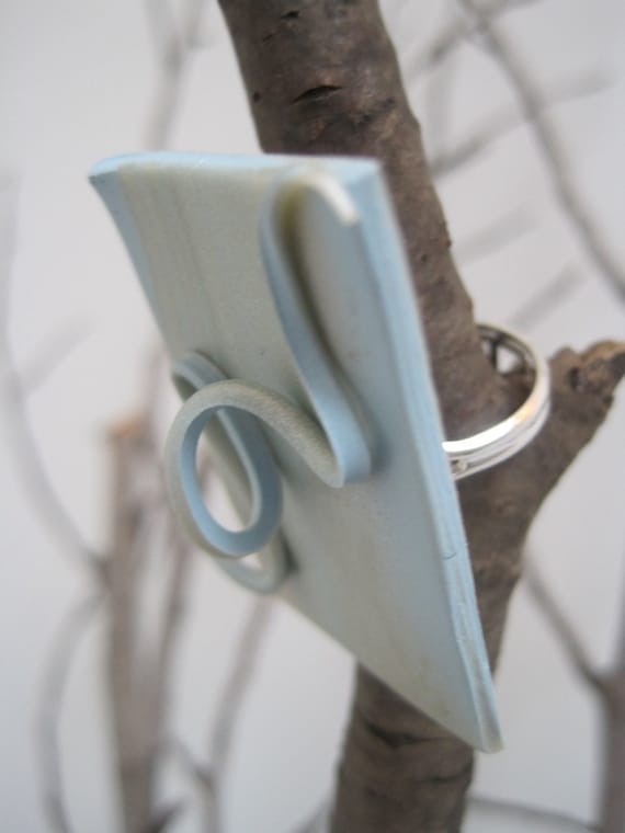
What did the White Pear Pinto Grigio inspire? Since the colours are pastel, light, citrus and lovely, I'm going to do a series of painted sculpted clay ruffles, that can be mounted on rings, hairclips or headbands!
Here's a peak at the blank canvas of one of the ruffles that you can expect to see in the shop this summer...